JANDI
2015 - 2016
Company
Toss Lab, Inc.
Creative Direction: Junhong Lee
Brand/Graphic Design: Bit Han, Junhong Lee
Illustration: Hyunjun Choi, Gwen Chen
UI/UX Design (Web): Jihoon Kim, Eunju Sohn
UI/UX Design (Mobile): Yujin Lee, Hyeryoung Choe, Nayoung Kang
Type Of Work
Branding, Brand Guidelines, Visual Identity,
Digital Design, Typography, Online Marketing
Stationery, Iconography, Stickers, UI/UX, Website
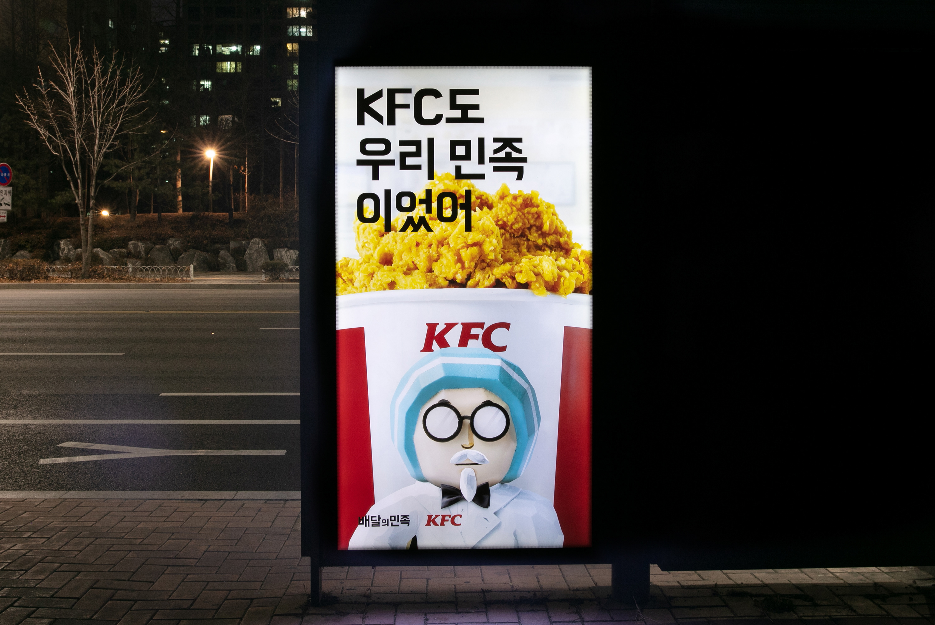
JANDI is a company-wide team communication messenger service that is currently being used by approx. 80,000 teams around Asia, including Korea and in the process of expanding the business area.
Accordingly, enhancements to the brand image and improvements to the overall design were required. We structured the overall system of the brand design and organized all forms of media both online and offline, while our focus remained in exhibiting an integrated brand image throughout.
—
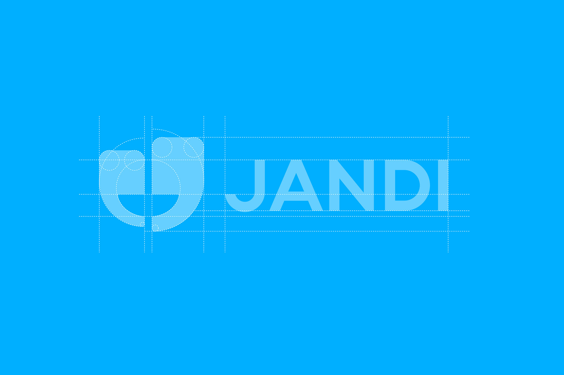
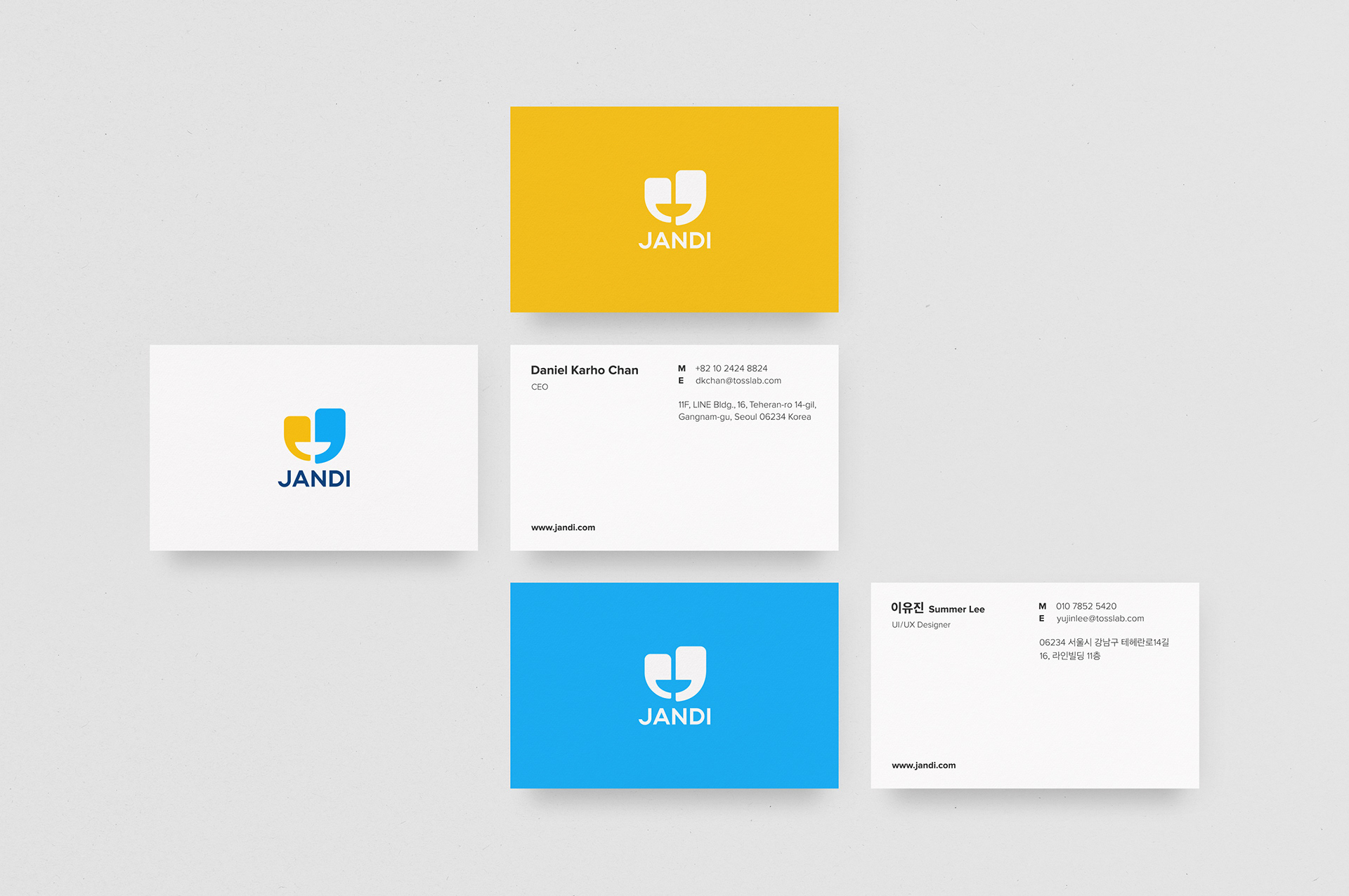
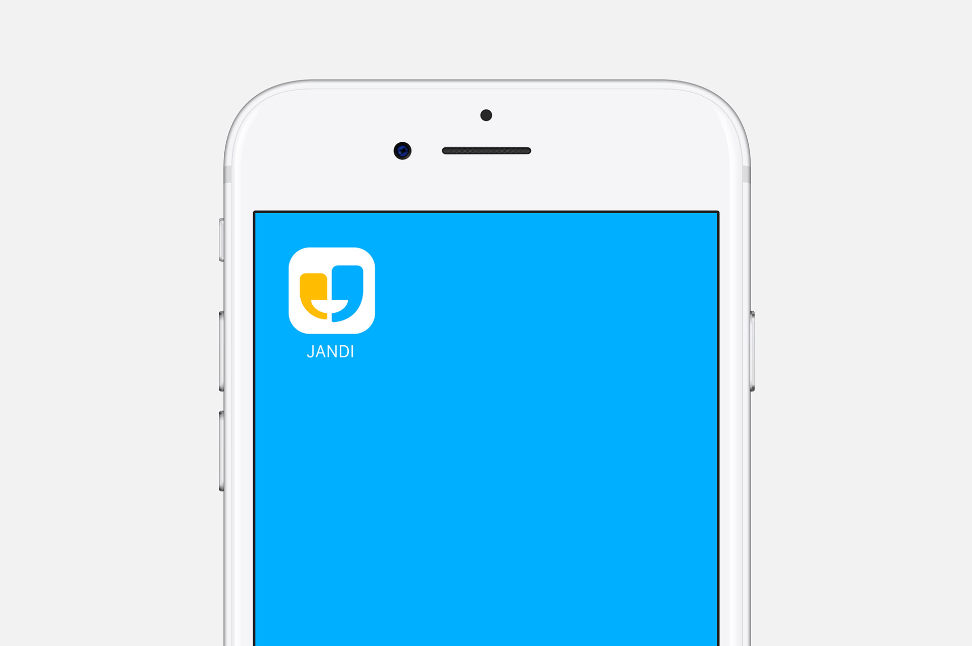
JANDI’s symbol conveys the emotion of happiness and satisfaction illustrating the seamless collaboration achieved by a department or a project using JANDI. It depicts a smile using two quotation marks facing each other symbolizing the importance of communication for effective collaboration. Two quotation marks were chosen and designed with different colors and sizes to express diverse people communicating and sharing opinions in a comfortable environment to create successful work.
Communication name ‘JANDI’ (‘grass’ in English) represents a new innovation as an essential enterprise messenger of current and future businesses. We pursue the importance of corporate culture to provide comfortable work environments between employees and deliver freedom to give opinions and thoughts as if a person is lying down on the grass in the warm sunshine.

—
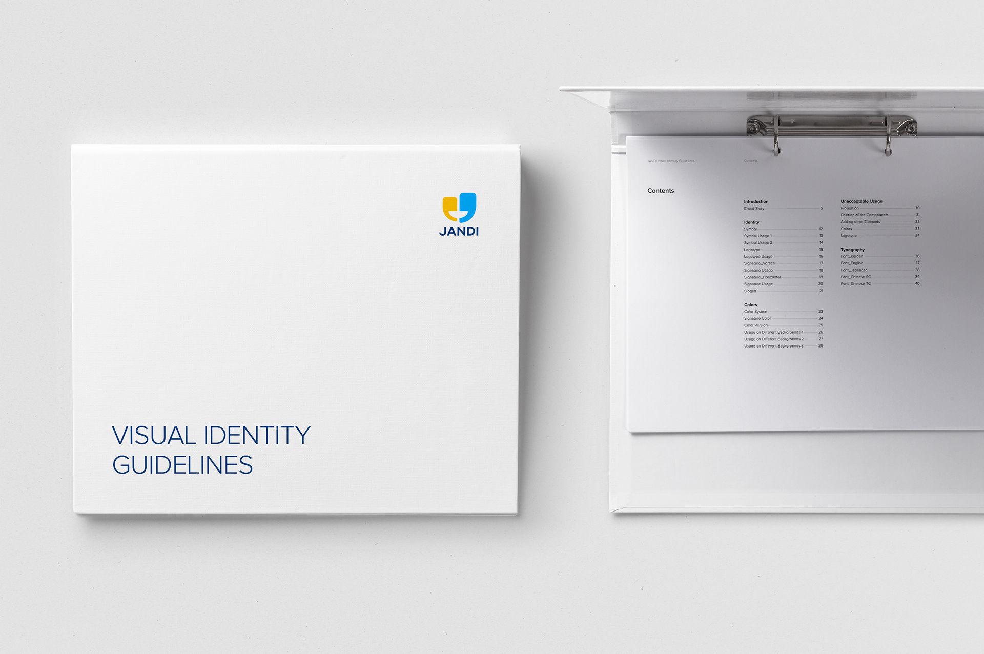
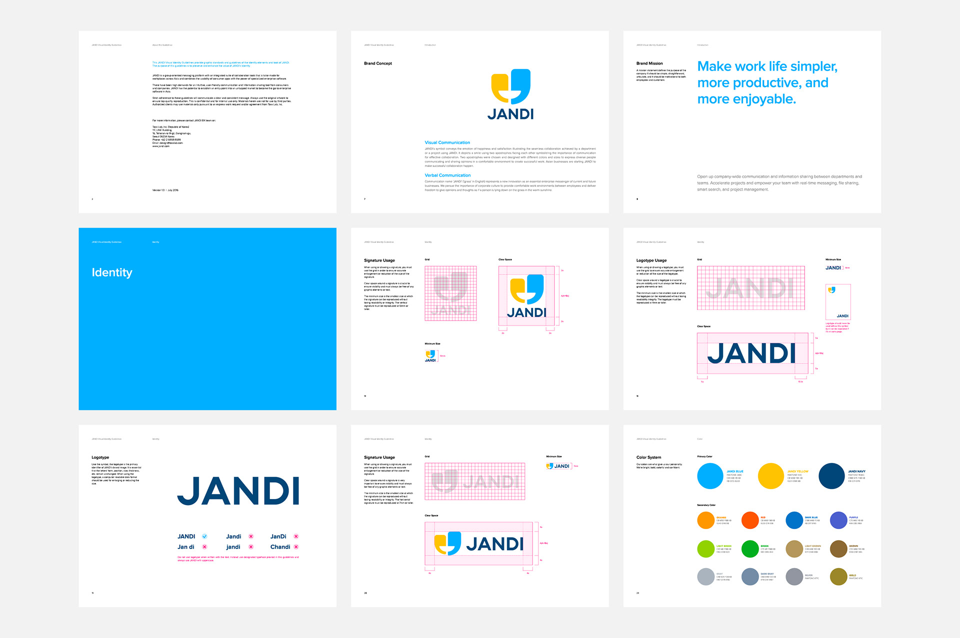
Visual Guidelines
In order to convey a coherent tone and manner, guidelines for every related fields — logo system, layout, color, typography, photographs, etc.— were produced and in fact its contents reflected in the final work. Afterwards, guidelines for tone of voice and illustrations continued to be produced and enhanced.

—
Typography
Proxima Nova and Sandol Gothic Neo1. In Korea where English is not the primary language, one may use hybrids formed out of Korean and English typefaces. We used two fonts that are varied in weights and relatively harmonious in form. We used Sandol Gothic Neo1 for Korean and Proxima Nova for English, numbers and symbols.

—
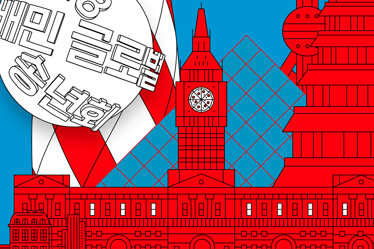
Online Marketing
Promotions take place almost every day via various online channels such as facebook and twitter. We decided that even such marketing should have rules and applied relatively flexible guideline. As for fonts, Sandol Gothic Neo Rounded, one of the series of the Sandol Gothic Neo, was used to convey friendliness. At most, certain limits were set for colors and style of images.
—
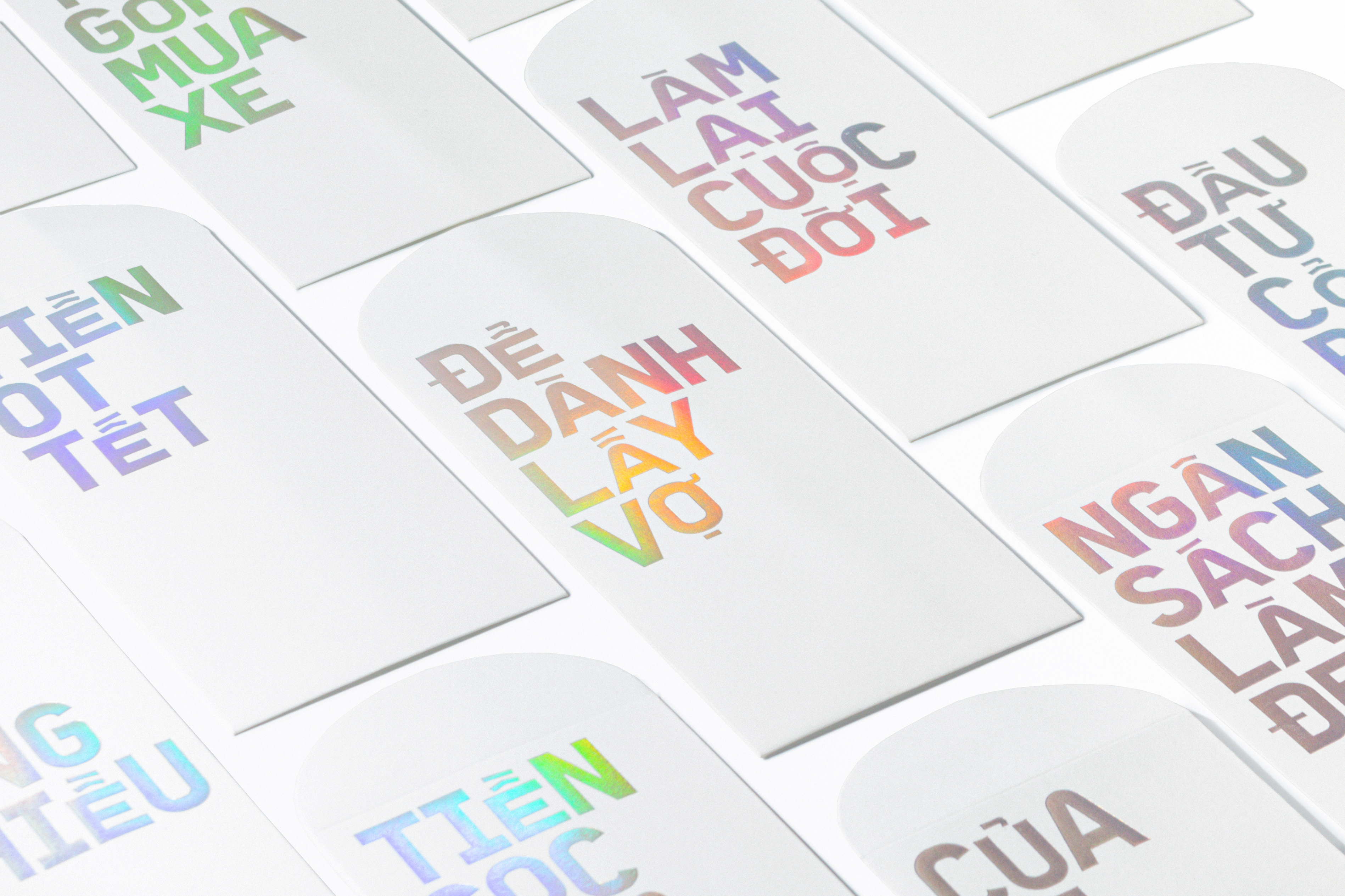
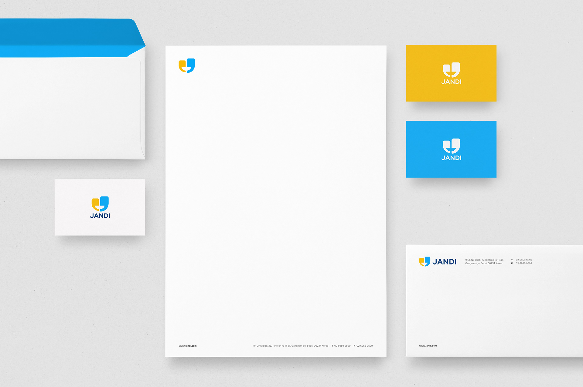
Stationery
While main color used in JANDI is usually blue, emptied backgrounds (white) was preferred for primary document forms. This simplicity seemed better suited for the brand and for using full-color logo. The other three primary colors were used selectively when needed.


—
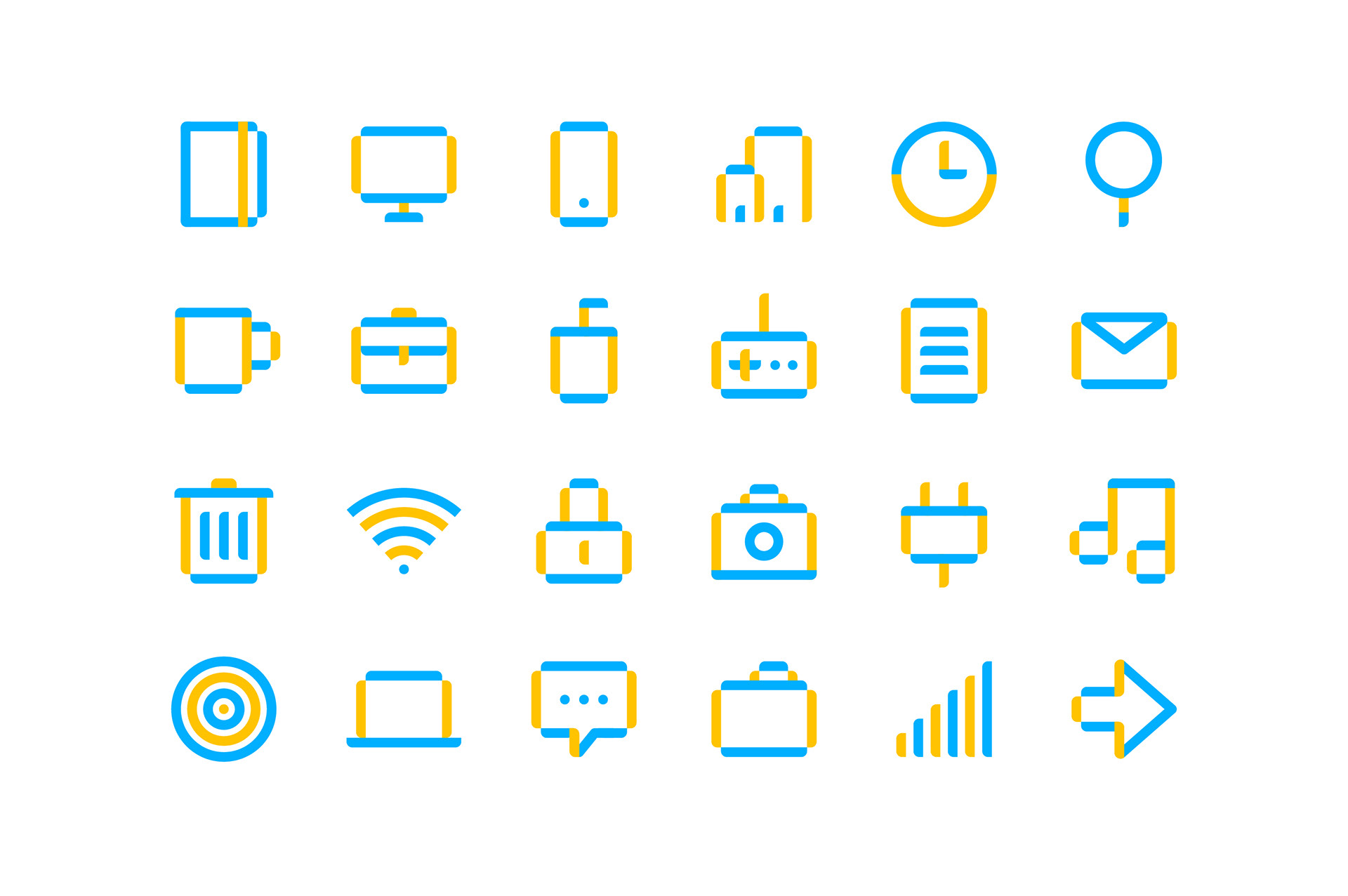
Iconography
Icon was designed by mirroring the colors of the logo and the formal characteristics.
—
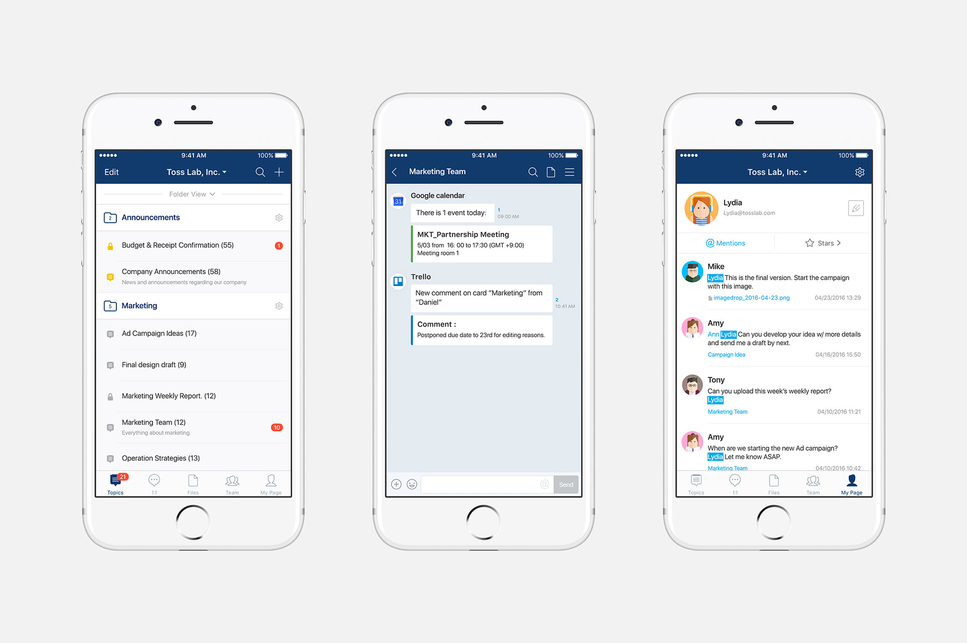
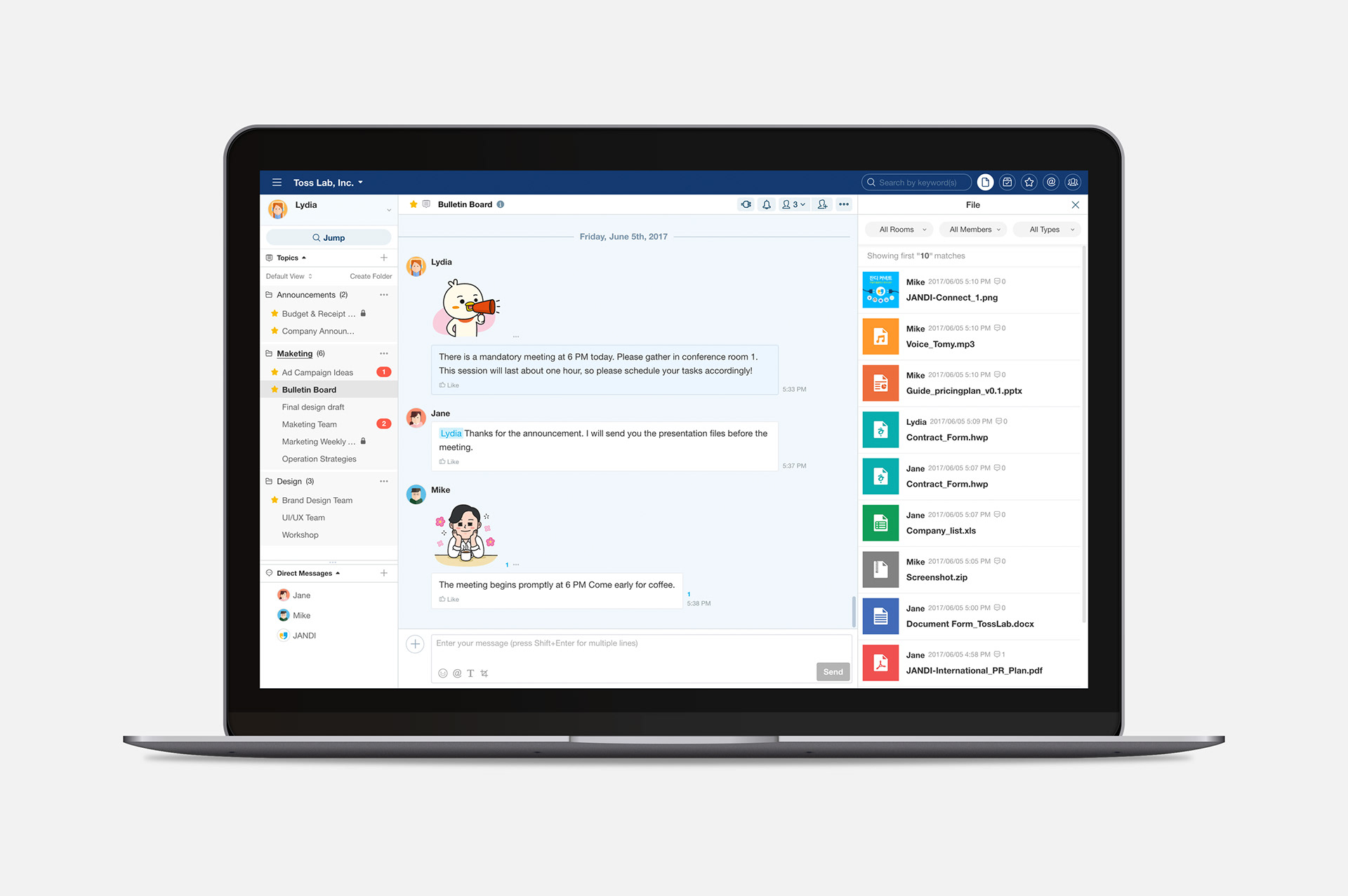
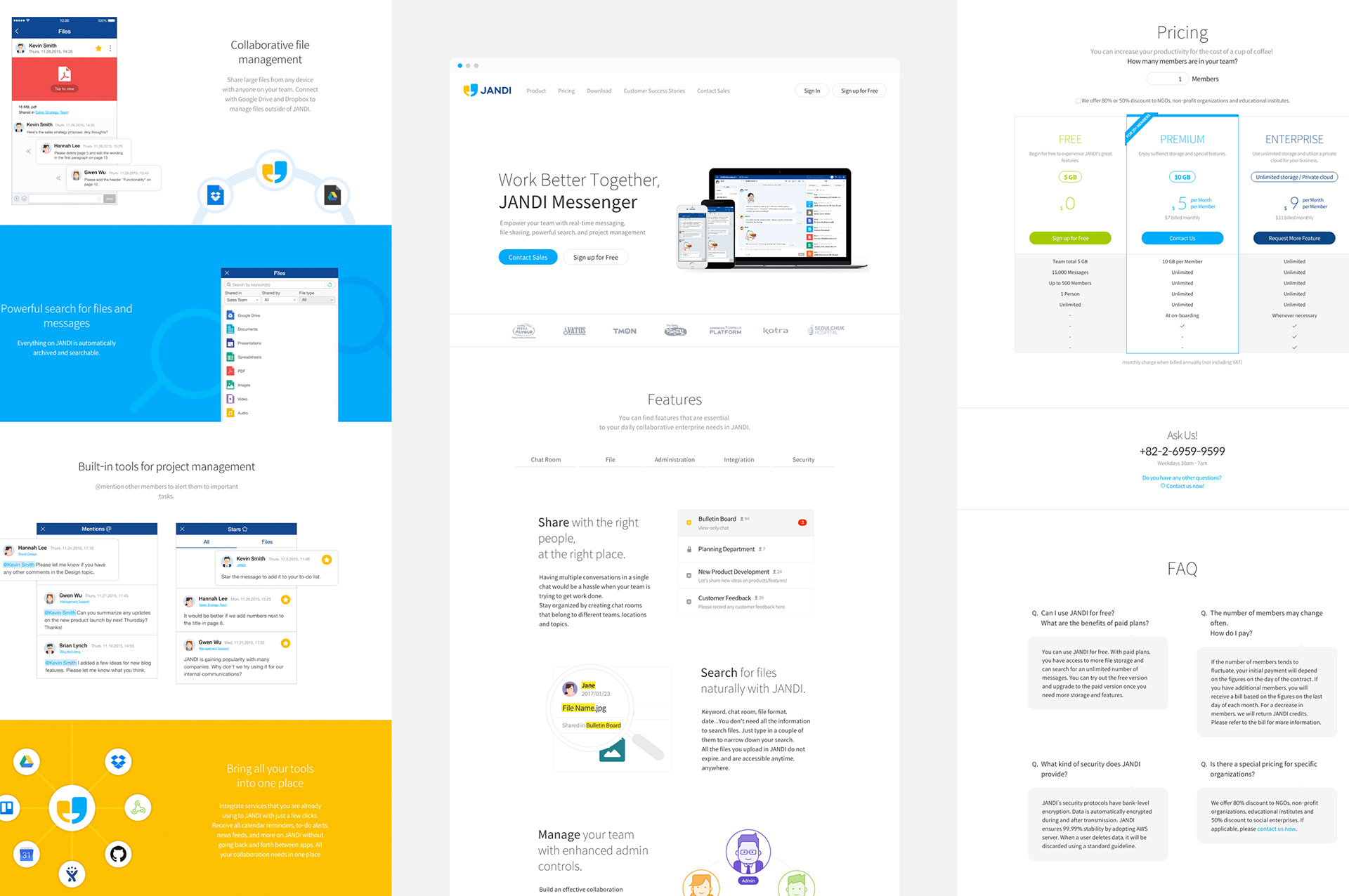
Product UI/UX
JANDI supports desktop application including web and mobile (android/iOS), and is designed for each device and OS. We invested a lot of time to improve the sync and speed of mobile and desktop. Also, to raise convenience of use, we reflected users’ opinions to improve UI/UX, and updating the requested functions by continuous development.


—
Stickers
JANDI is a messenger service that aims to bolster work productivity. We studied the types of communications during business tasks and turned them into messenger stickers so that the users may communicate diverse emotions and ideas effectively. When new series were created, the amount of usage of the previous stickers was studied and then the results were applied the new designs and expressions of emotions.
—
Website
A new website was built after a long period of planning. Each section—such as the primary function of the product, customer success stories, product inquiry—was summarized anew and designed considering the customer needs and the page exposure based on collected statistics data.